PHP Notices, Warnings and Errors on Your WordPress Site
Websites are never too far from problems. If you run a WordPress website, you will need to spot and fix problems. WordPress works on PHP.…

Websites are never too far from problems. If you run a WordPress website, you will need to spot and fix problems. WordPress works on PHP.…

Do you accept guest blog posts on your WordPress site? It’s a great way to drive traffic to your site, improve your SEO, and create…
One of the questions we get often from WordPress students: “How do I control what users can and cannot do on my site?” There are…

WordPress arrives with five user roles that you’ll see on a new site. These roles are in a hierarchy from Subscriber up to Administrator. Subscribers…
Out of the box, WordPress offers two different ways to organize Posts; Categories and Tags. The technical names for all these are taxonomies. “What’s a…

WordPress is an excellent platform for writing, editing and publishing content. So it’s important to know who has permission to do that on your WordPress…

By default, WordPress arrives with five default user roles: Contributor, Subscriber, Author, Editor, and Administrator. However, when you start installing plugins, you may see many…

Most people agree, that sliders or carousels give your WordPress site a professional and fresh look. The Metaslider Plugin adds this functionality and provides some interesting…
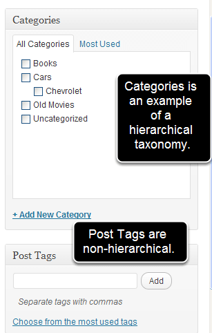
Taxonomy is a common word in biology. In science, it’s a hierarchy of terms used to classify almost everything. Wikipedia has a full explanation here.…

PublishPress Statuses is a must-have WordPress plugin if your blog has multiple contributors. It features several tools that will help you improve your blogging workflow.…
“Taxonomy” is a confusing word and one that many people don’t like. It’s hard to remember, it contains the word “tax”, and it sounds like…

One common problem facing WordPress users is the amount of spam comments. There are some spam-fighting tools such as Akismet and Mollom, but some WordPress…

WordPress is a great platform and has surprisingly flexible permissions. However, by default, the permissions system keeps to the WordPress philosophy of “Decisions, not options”.…

Edit Flow is a WordPress plugin used by many blogs, newspapers and magazine sites. A few years ago, Edit Flow was acquired by Automattic, the…


Co-Authors Plus is an old and popular WordPress plugin. By default, WordPress allows you to choose a single author for content. Co-Authors Plus was a…

In WordPress 5.8, they released a new feature called the Query Loop Block. If you haven’t checked it out, it’s definitely worth looking at! You…
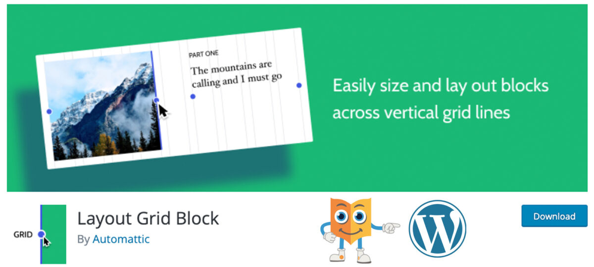
The Layout Grid Block plugin can help you to insert content blocks in a grid format. This way, it is possible to create consistent layouts…
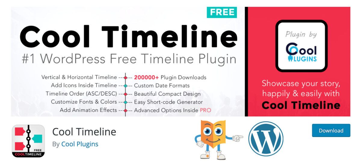
A timeline is really useful when presenting and visualizing content. It is a simple way to gather information and present it in a nice sequence.…
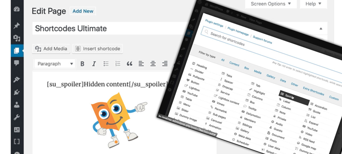
The Shortcodes Ultimate Plugin for WordPress provides a set of useful shortcodes to embed into your WordPress content, or into other regions where the use…
Please confirm you want to block this member.
You will no longer be able to:
Please note: This action will also remove this member from your connections and send a report to the site admin. Please allow a few minutes for this process to complete.